Scandinavian winters keep people indoors for roughly six months a year, which gives Swedish designers a lot of time to think about what a kitchen surface shoul…Scandinavian winters keep people indoors for roughly six months a year, which gives Swedish designers a lot of time to think about what a kitchen surface should feel like when it becomes the primary thing you look at during months when going outside requires genuine commitment. Electrolux leaned into that constraint at Milan Design Week 2026, partnering with Italian kitchen specialist Veneta Cucine to present a color palette pulled directly from nature. Warm sand, dusty teal, soft sage, speckled stone. Colors designed to reduce visual noise and make a kitchen feel less like a collection of separate purchases and more like a unified spatial environment.
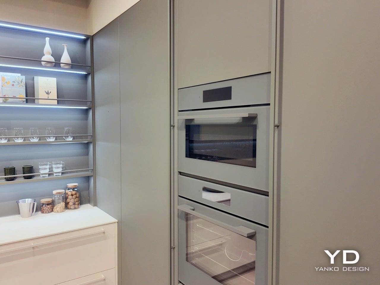
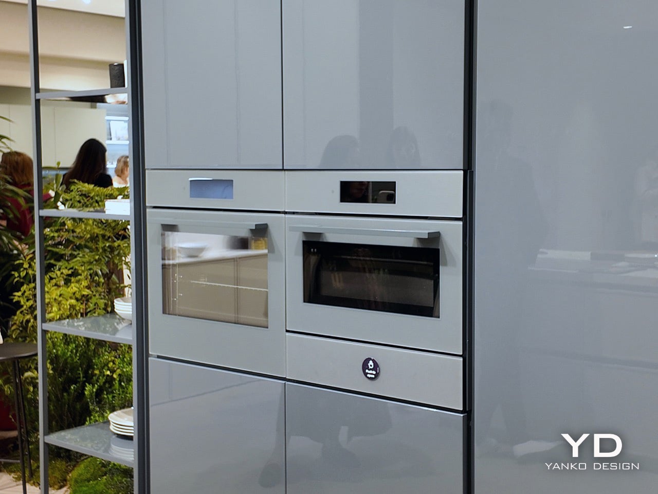
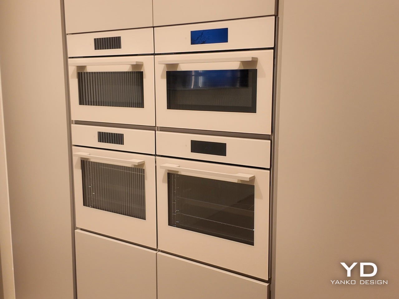
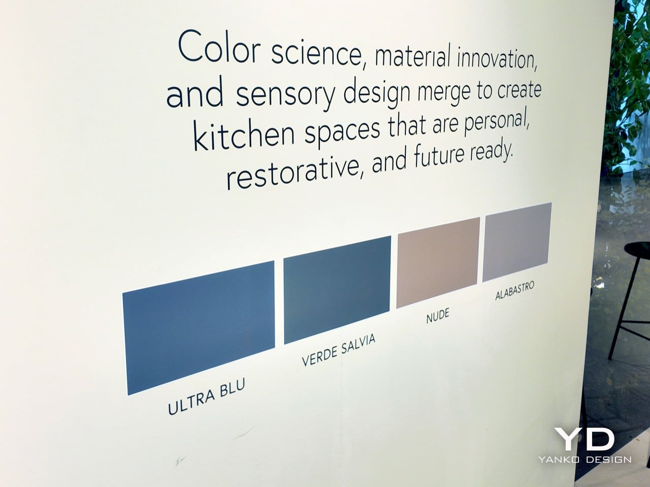
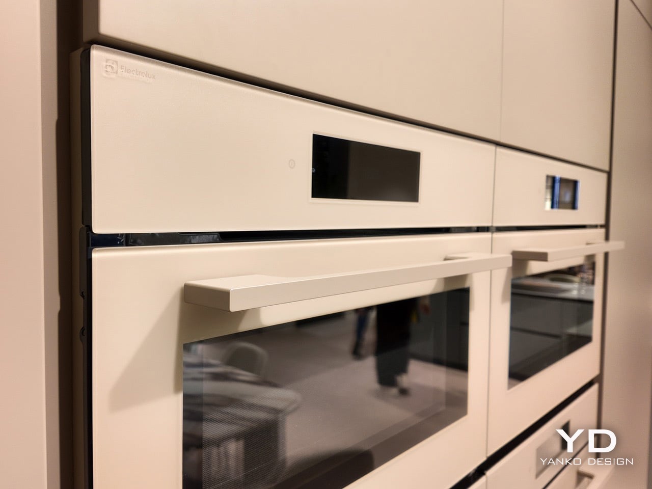
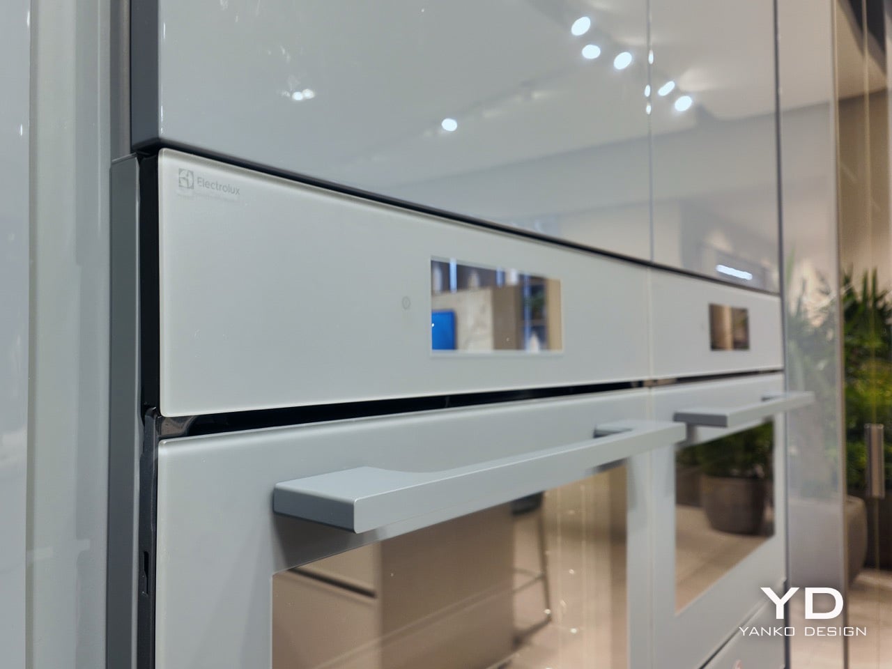
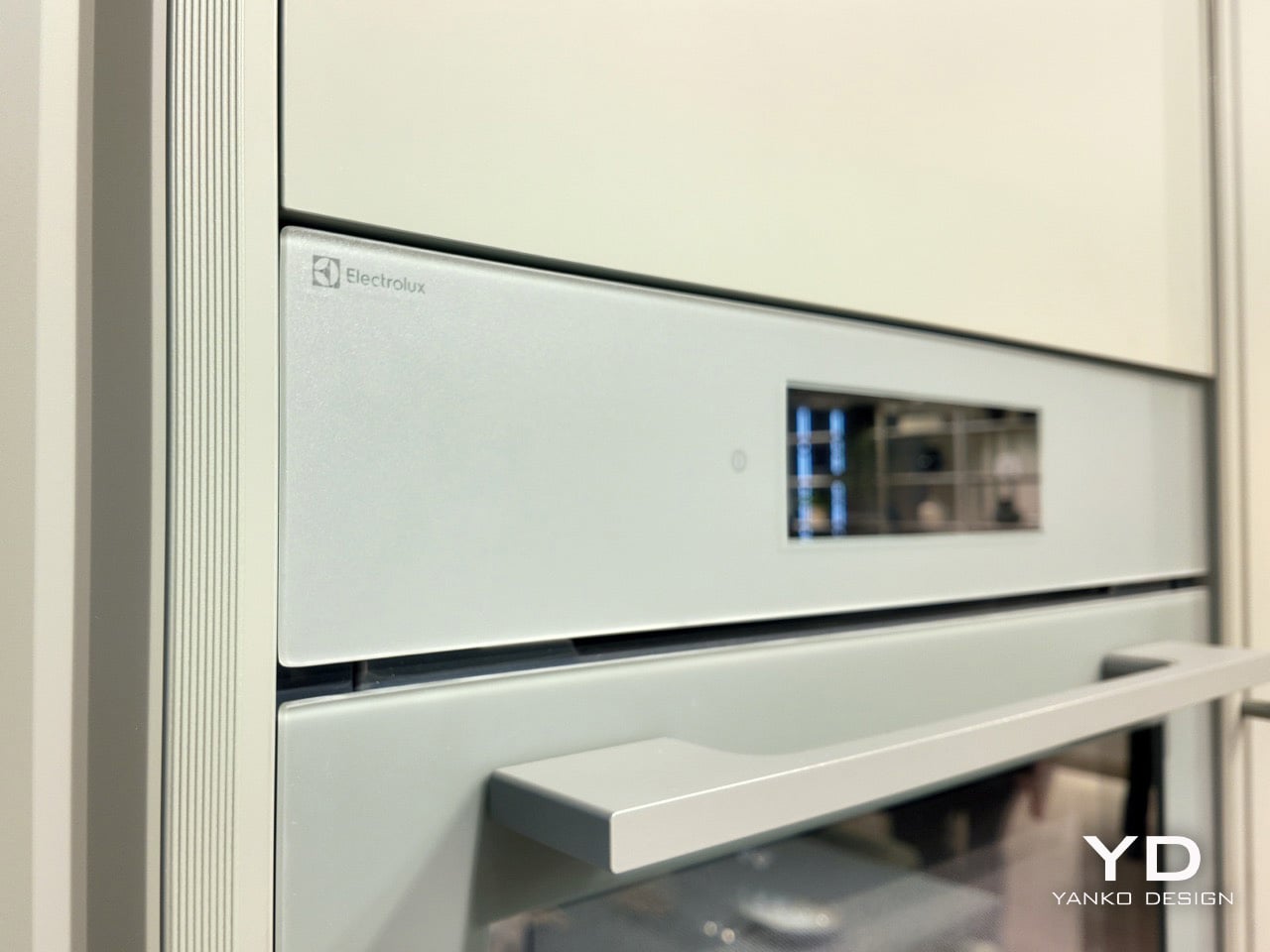
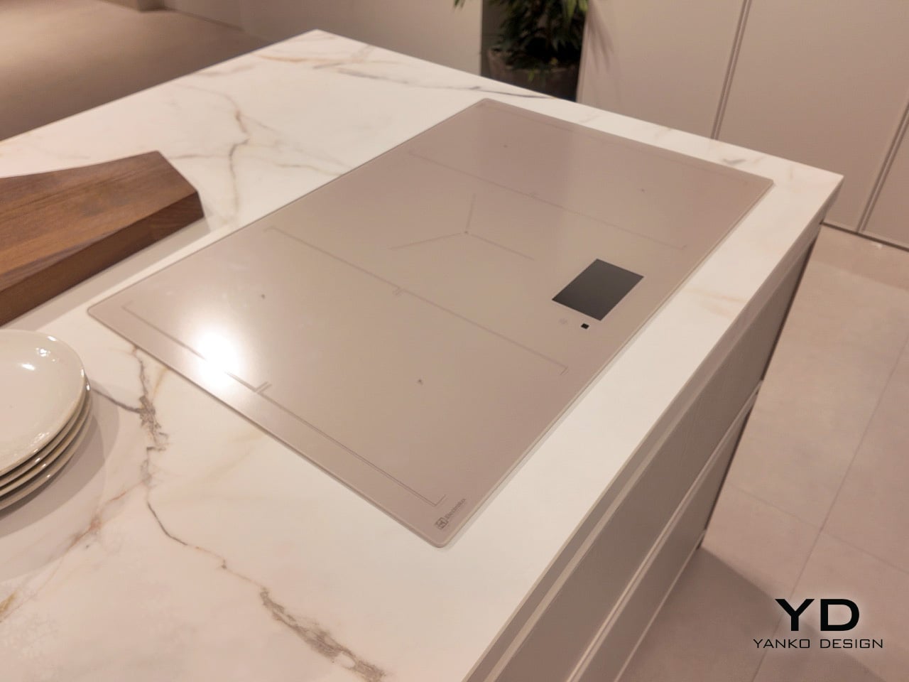
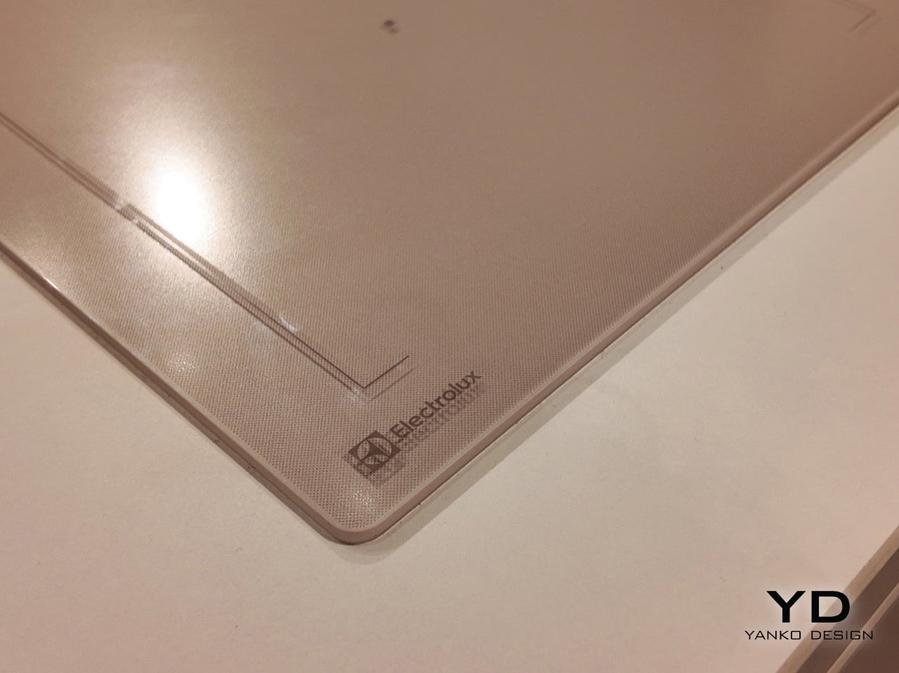
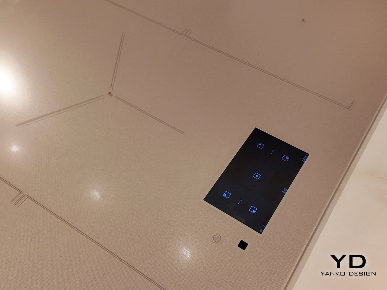
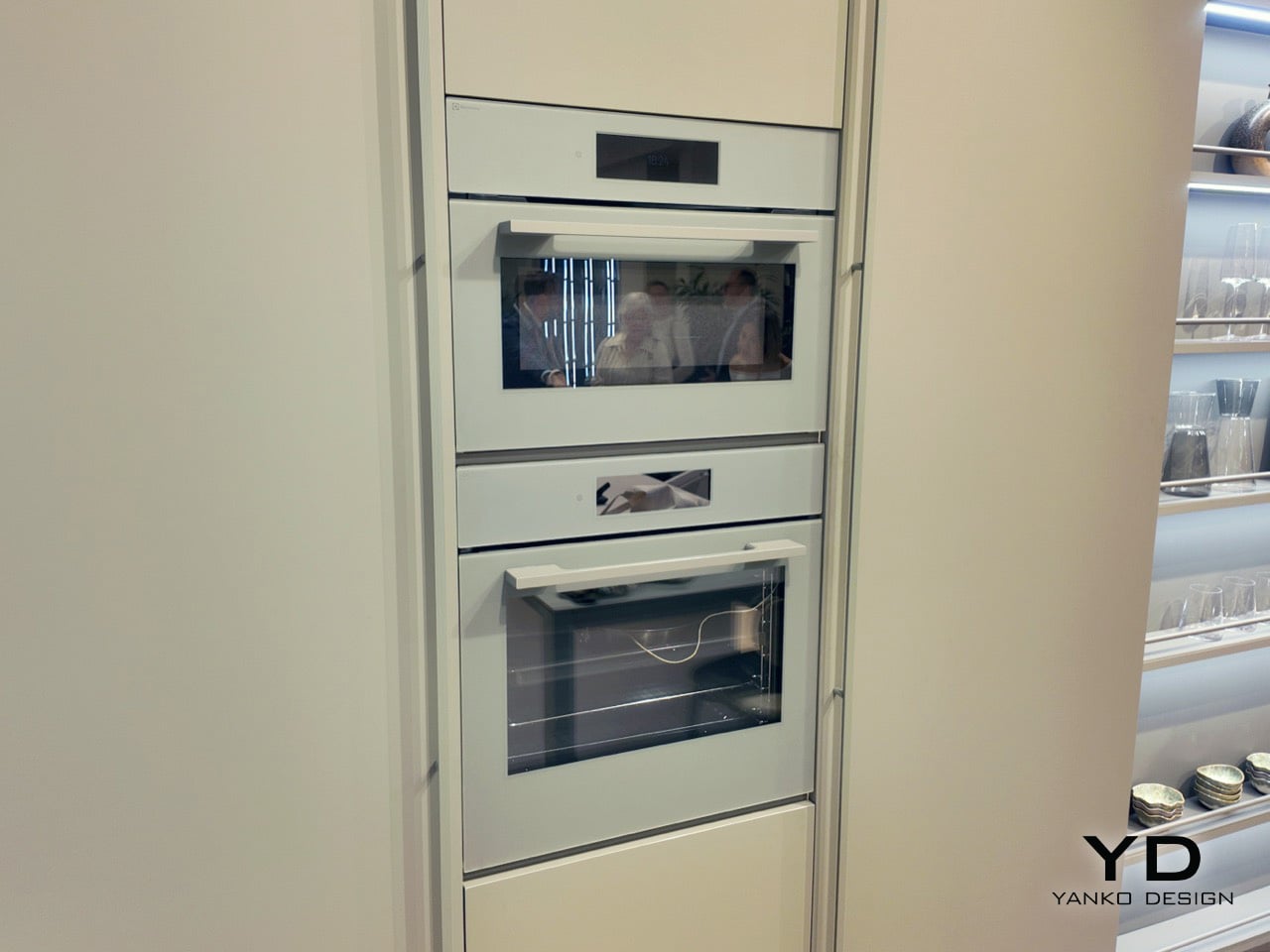
The four color concepts (Ultra Blu, Verde Salvia, Nude, Alabastro) get applied to both appliances and cabinetry, creating kitchen installations where ovens genuinely disappear into walls. The collaboration is grounded in research showing that people across European markets identify nature as their primary source of emotional restoration, so Electrolux decided to bring that restoration indoors. The result is a palette that feels geologic rather than trendy, with appliances that function as architectural elements instead of shiny metal boxes standing awkwardly in the corner.
Designers: Electrolux & Veneta Cucine
The approach hinges on something Amelia Chong, Electrolux’s Principal Color, Material & Finish Designer, calls thinking architecturally from an interior perspective. Color becomes a series of spatial blocks connecting products with their surrounding environment. Each palette is experienced through a curated interplay of materials, finishes, and furniture elements, both visual and tactile. Ultra Blu spans two graduated tones, a deeper navy fading into dusty teal. Verde Salvia delivers sage in its most restrained register. Nude reads as warm sand with subtle blush undertones. Alabastro arrives as speckled stone-effect gray, the kind of finish that looks different depending on light quality throughout the day.
Electrolux backs the palette with neuroaesthetic research claiming that biophilic color schemes can reduce perceived stress levels by as much as 35%. That statistic repositions what a kitchen appliance actually does in a home. Your refrigerator is cooling groceries, sure, but it’s also contributing to the sensory atmosphere of the room, shaping how calm or agitated you feel when you walk in to make coffee at 6am. The palette’s muted tones (warm neutrals, soft earth-rooted hues) create what the research describes as a perceptually grounded environment that reduces mental fatigue. In practical terms, this means your kitchen quits visually shouting at you.
Electrolux X Veneta Cucine’s Nude Colorway
Electrolux X Veneta Cucine’s UltraBlu Colorway
The partnership brings together two distinct design traditions in a way that actually makes sense. Electrolux contributes Scandinavian simplicity and human-centered clarity, the kind of restrained functionality that emerges from cultures where you spend half the year looking at the same interior walls. Veneta Cucine brings Italian craftsmanship and material expression, the tactile richness and attention to finish quality Italian furniture makers have been perfecting for generations. Daniela Archiutti, Veneta Cucine’s Art Director, positions the collaboration as merging color science, material innovation, and sensory design to create spaces that feel personal, restorative, and future ready. That’s a lot of adjectives for kitchen cabinetry, but the installations at Milan back up the claim.
Electrolux X Veneta Cucine’s Verde Salvia Colorway
Electrolux X Veneta Cucine’s Alabastro Colorway
The Milan showcase itself was staged as physical proof of concept. Concrete plinths topped with living moss carried CMF swatches in the four palette tones. A pine and wood scent developed by studio Koyia moved through the space. Appliances were displayed against photographic prints of Scandinavian woodland. The sequence was deliberate and consistent, building an argument that the kitchen functions as an emotional environment where design’s most sophisticated move is bringing the outdoors inside. The ovens, hobs, and refrigerators on display integrated so seamlessly into cabinetry that distinguishing appliance from architecture required genuine attention.
You’re an expert editor/blogger with a profound understanding of human psyche as well as Google SEO. Now generate 10 catchy, attention-grabbing, mildly provocative titles that are SEO-friendly too. Make your titles have natural language but craft them so they rank high on google News and Discover as of March 2026. Do your SEO research. Make them natural language, simple, yet captivating
The post Electrolux and Veneta Cucine Use Biophilic Color Science to Rethink Kitchen Design at Milan 2026 first appeared on Yanko Design.